Featured Image Credit: Curioso Direito
If you already have your layout planned out and just need that extra be of decoration to finish out the page… then these bullet journal fonts and lettering ideas are definitely going to give you the inspiration to need to make it look perfect! I tried to find a nice variety so whether you like a super simple look or a colorful bubble letter, you’ll find the one that fits you. I’ll also be updating the list and finding new examples so let me know which ones you like the best!
Here are the bujo fonts:
Donut Themed Lettering
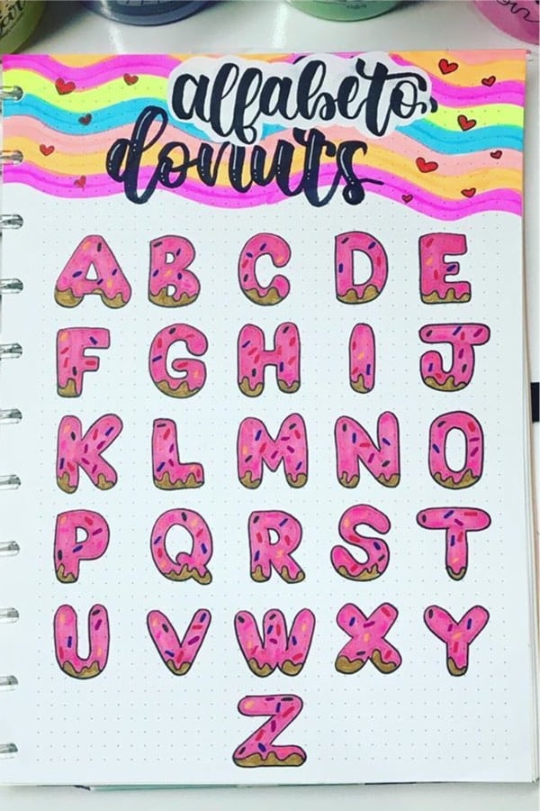
Photo credit: Juliana Germano on Instagram
Every Sunday is DONUT day for me… so it’s no surprise that I love this bullet journal font! This would make the perfect header if you’re going with a dessert or food theme for the month. But even if you aren’t, you could just change up the color scheme and have some fun but simple bubble lettering!
Related Bujo Post: Best Bullet Journal Header & Title Ideas
Rainbow Bullet Journal Font
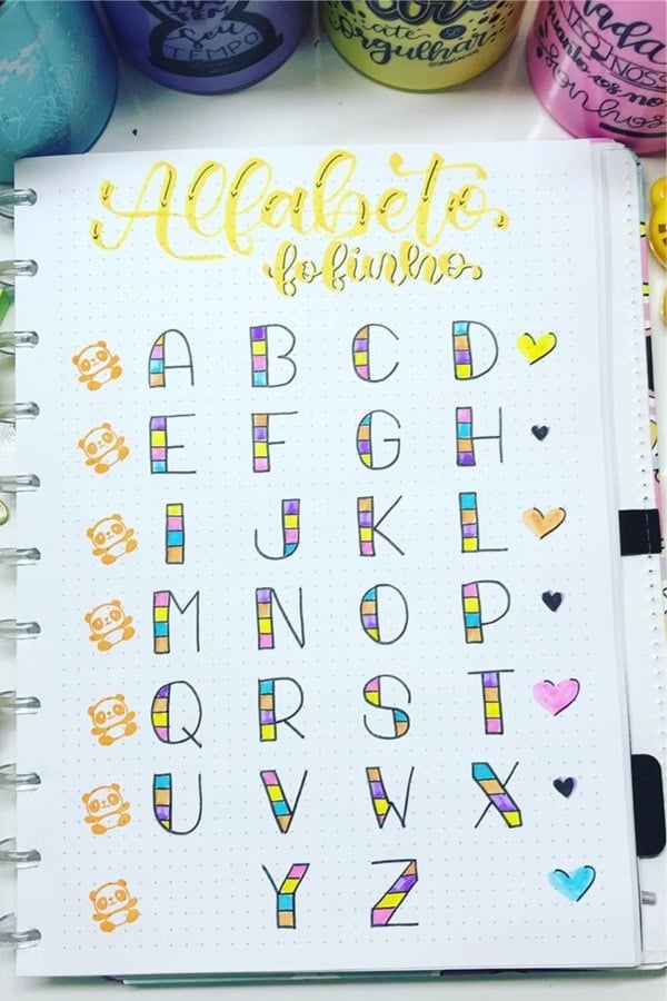
Photo credit: Juliana Germano on Instagram
Now, if you want to go with a lined font but still want to add some color… then this one is for you! I love how the letters are all pretty simple but the colors really make them pop. This would be great in any spring theme!
Single Line Bujo Font
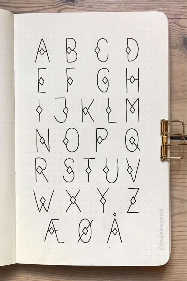
Photo credit: Nina on Instagram
Speaking of a lined font, this one really makes things simple but still has a bit of decoration tucked in there. I love the minimal look and you could even leave out the little diamonds and go for the full minimalist look!
Drop Shadow Lettering Inspiration
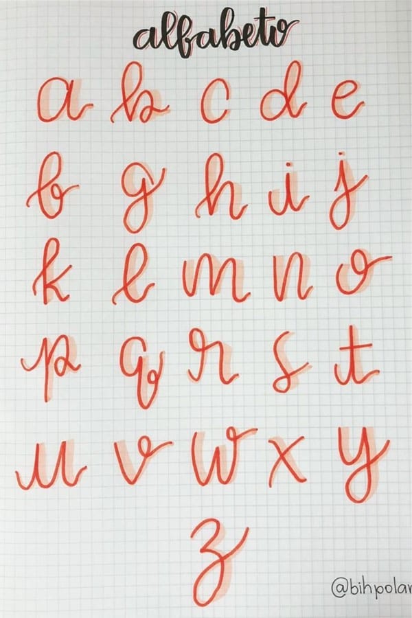
Photo credit: Lettering Da Bianca on Instagram
If you’ve read any of my other posts, then you’ll know I’m a die-hard fan of a drop shadow… on just about anything! So I’m really loving this font for not only the peach colored drop shadow but the overall simple flow of the letters
Related Bujo Post: Best Peach Themed Bullet Journal Spreads
Pastel Bullet Journal Lettering
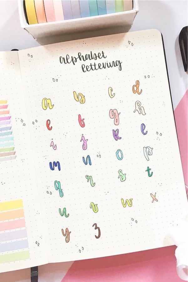
Photo credit: Blossom Bujo on Instagram
It doesn’t matter what color or theme you might have currently in your bullet journal… I’m sure this font would look great with just about anything! I love how she uses a different color for each letter but I think they would also look great in a single color that matched your setup!
Creative Bujo Alphabet
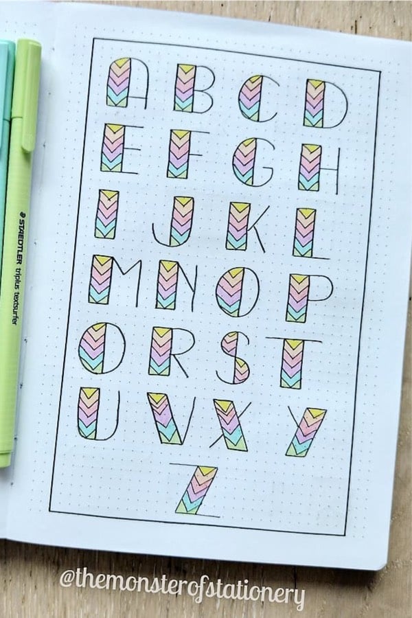
Photo credit: The Monster Of Stationery on Instagram
Boxy, bold and colorful… what’s not to love! This font is similar to the one from a few about but I really like how they incorporated a little design in the colored section. Spring or not, this would really add the finishing touch to your weekly spread or cover page!
Bullet Journal Handwriting
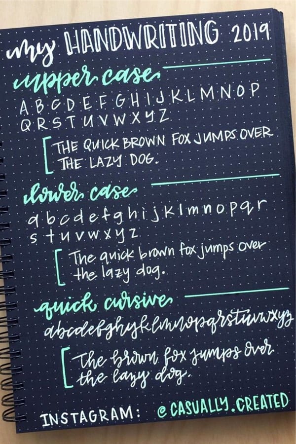
Photo credit: Casually Created on Instagram
If you don’t really want to go with a super decorative font, then this handwritten one might be more your style! I love how she includes both upper and lower case along with some quick cursive at the bottom. This is a good all-around lettering style that could dit with plenty of different themes!
Related Bujo Post: Best Black Bullet Journal Spread Inspiration
Bullet Journal Calligraphy
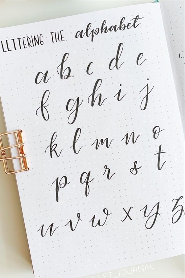
Photo credit: Liv on Instagram
If you like the font from above, you’ll definitely like this one too! It’s clean, elegant, and would fit perfectly in a minimalist styled layout. I’m definitely going to have to practice a bit to make mine look good… but it will be worth it for sure!
Upper & Lower Case Bujo Letters
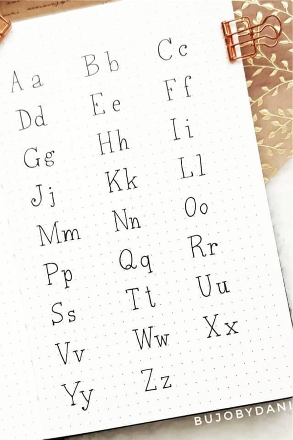
Photo credit: Dani Di on Instagram
Now this one is more my speed! Again, I love having both upper and lower case options which make it easier for a weekly spread header or title for my habits. Simple, clean, and to the point with this font!
Black & White Bullet Journal Font
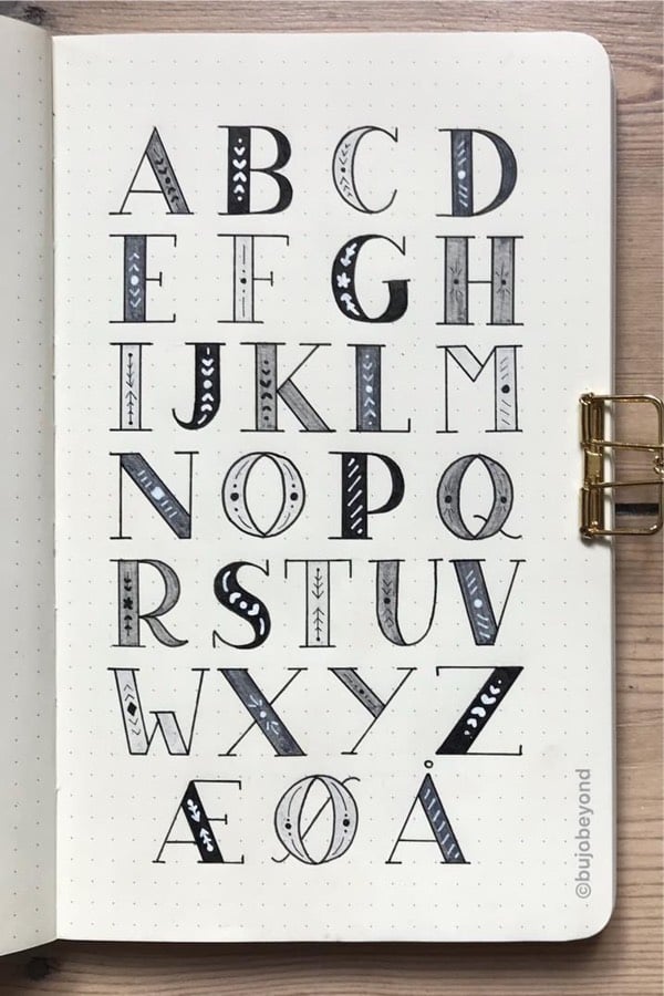
Photo credit: Nina on Instagram
These letters have that stencil look and I love how she adds in those little details for each one! If you change out the color and add your own decoration… you could have a stunning custom font in no time
Related Bujo Post: Best April Bullet Journal Header Ideas
Purple Bullet Journal Font
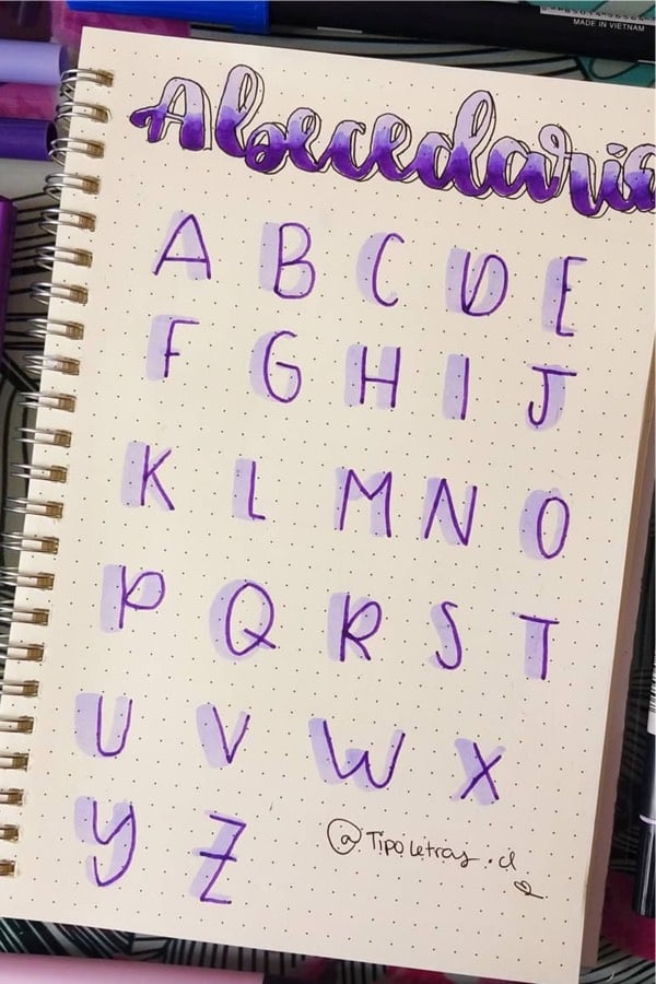
Photo credit: Petu on Instagram
As I mentioned above, drop shadows on anything just makes it better! I love the dark purple color of the font paired with the light purple drop shadow which makes the simple style really stand out. This one would look perfect in a lavender themed layout!
Tie Dye Bujo Letters
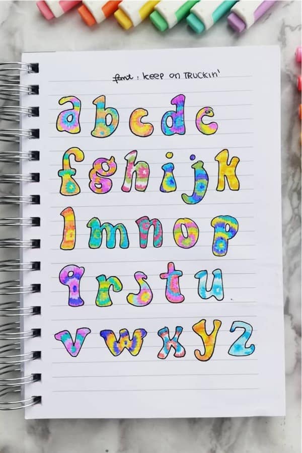
Photo credit: Sara on Instagram
70’s vibe and some super cute tie-dye coloring… yes, please! The actual font fits perfectly with the tie-dye but you could also use that color scheme in any other bubble-styled lettering if you wanted to stick with those colors. I think it would look great on a 3D font as well!
Related Bujo Post: Best Bullet Journal Banner Doodles
Highlighter Journal Font
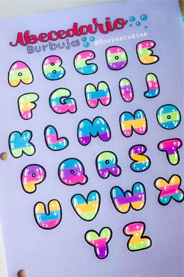
Photo credit: Rosyestudies on Instagram
Now if you want to combine bright colors and a super cute bubble lettering font… this is one is perfect! The colors really make this one jump off the page and I love how she adds the little white details to make them look even more rounded. Plus, the colors going horizontally are such a good idea!
Teal Alphabet Lettering
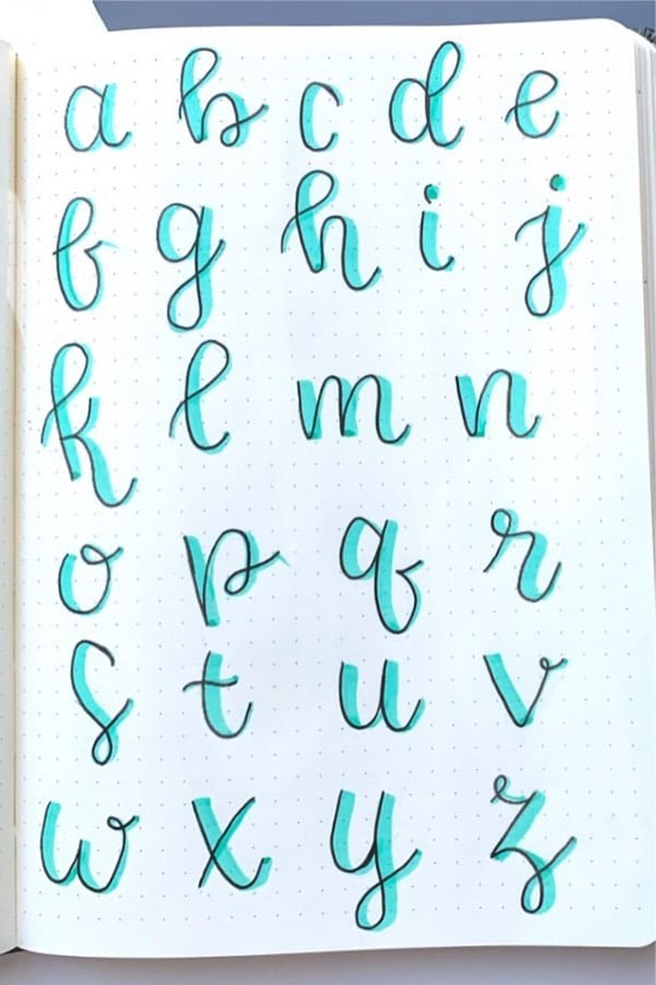
Photo credit: Kathy on Instagram
Keep it simple with a nice cursive handwritten font with a little bit of personality with that teal color behind it! And just like many of the other ideas here… you could change out the color to match your theme perfectly
Green Alphabet Inspiration
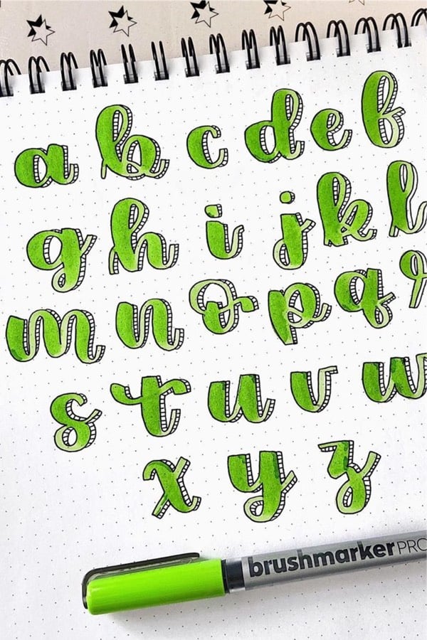
Photo credit: Mayra Ruiz on Instagram
Not only do I like how she has the 3D look set up with the little lines to give it some depth, but the way she shaded in the green is amazing! If you’re a fan of bubble lettering and solid colors then this might be the one to try
Related Bujo Post: Best Pineapple Bullet Journal Spread Ideas
Gradient Bullet Journal Letters
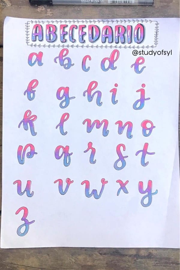
Photo credit: Study Of Syl on Instagram
Gradients and drop shadows are my favorite things when it comes to giving my spreads that subtle decoration! I love how she used three colors in the lettering and you can really see how much that drop shadow effect changes the overall look of the font. This one is goals!
Striped Bullet Journal Font
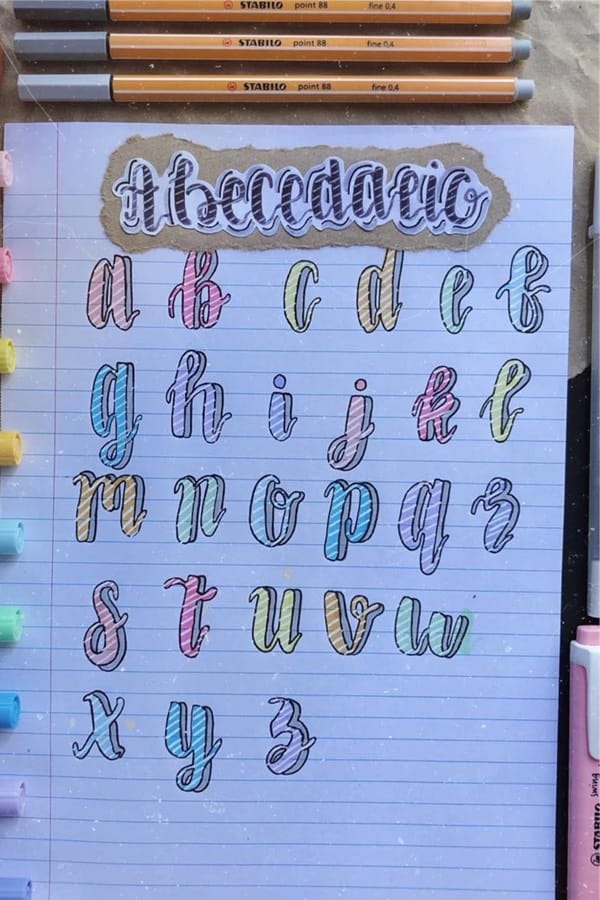
Photo credit: Mabelle Creative on Instagram
All I could think about when I first saw this alphabet spread was that fruit stripe gum lol! The light color of the letters paired with the even lighter stripes is something I haven’t seen before but I’m loving it. If you’re going with a light and playful theme this month, this would definitely work well with that!
Related Bujo Post: Scrapbook Bullet Journal Ideas
Bubble Letter Alphabet Inspiration
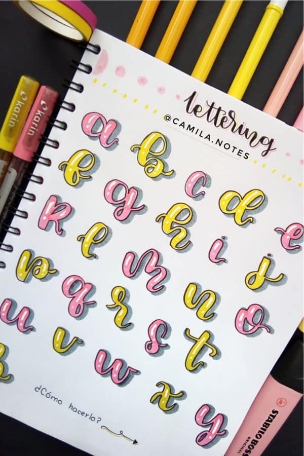
Photo credit: Camila Notes on Instagram
If you need a spring-themed font for one of your layouts then this pink and yellow alphabet might give you some ideas! I personally really like the pink color but I could also see the yellow working well with a lemon theme or something similar
Pink & Purple Bujo Alphabet
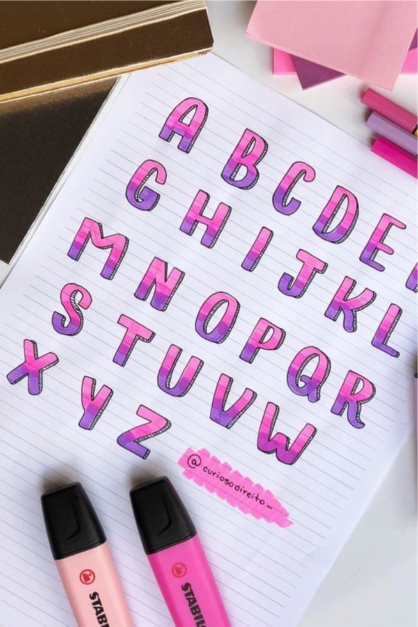
Photo credit: Curioso Direito on Instagram
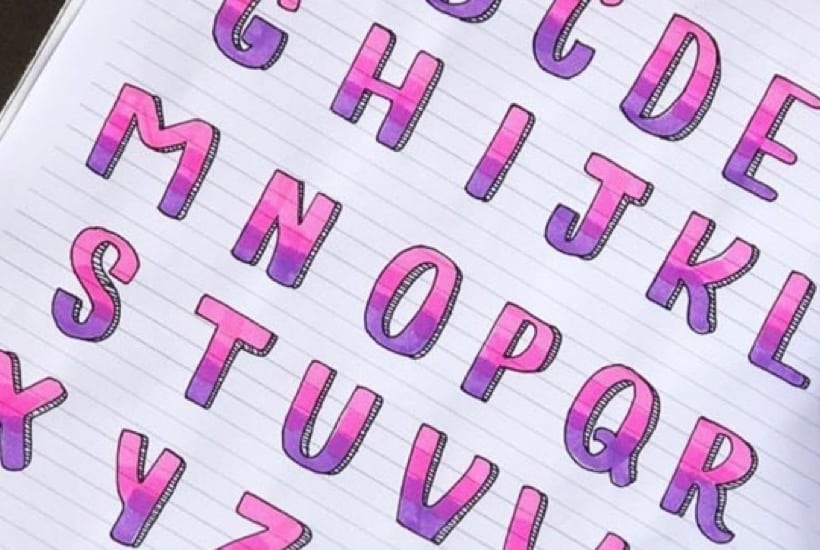
Okay… I might be picking a lot of fonts with a gradient but I just can’t help it! I really like how the 3D look is very thin so it doesn’t make the lettering look too bulky. Plus, I could see this color scheme working perfectly with a floral or butterfly theme!
Bullet Journal Header Lettering
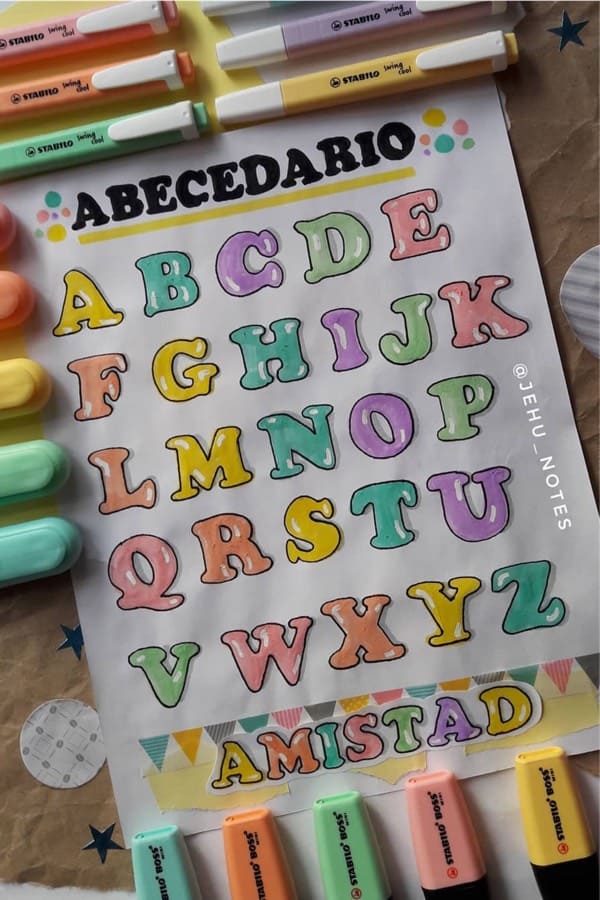
Photo credit: Jehu Notes on Instagram
Whether you want to stick with a single color or have a few throughout your lettering… this spread is filled with great ideas! Everything from the classic bubble style font to the subtle shadow and highlights, you could take the concepts here and apply them to just about any other font out there!
Rainbow Alphabet For Bullet Journal
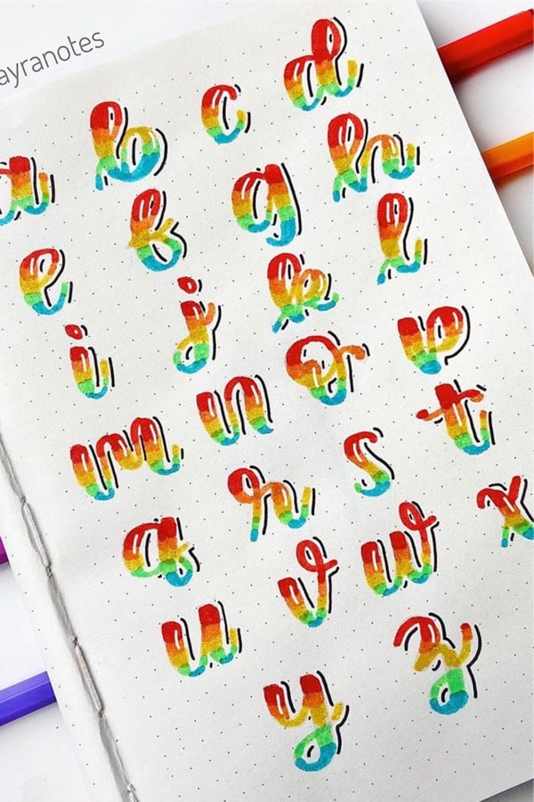
Photo credit: Mayra Ruiz on Instagram
Here’s a perfect example of how to use multiple colors in a single font while still making it look like everything works together. I would have to try some other colors out to see but… I think the colors she colors are perfect for this style. Plus, the way she used the white highlights on the letters and the black lowlights on the edges make it look less flat without going full bubble style!
Related Bujo Post: Bullet Journal Paper Notes Doodles
Light Blue Bujo Letters
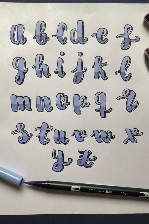
Photo credit: Universoapuntes on Instagram
This light blue… almost muted blue colored font is a great example of the classic gradient and drop shadow style without going crazy with the color scheme. I could see something like this working well with a clean and simple layout while having the focus be on your headers!
90’s Style Bujo Font
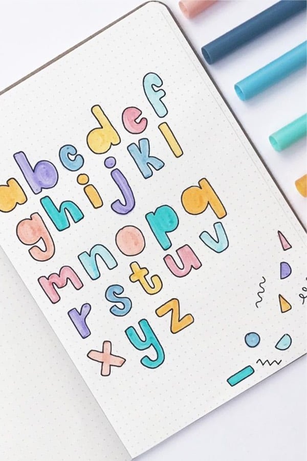
Photo credit: Mabel on Instagram
If you’re a fan of keeping things simple and like the flat-styled fonts… then this one might work well with your theme! She uses colors that aren’t really pastel but aren’t really super bright either which I think works perfectly with these letters. You could even take inspiration from those little doodles and use them throughout your spreads to add some fun color!
Related Posts:
📌 FOLLOW ME ON PINTEREST!
📌 PIN TO SAVE FOR LATER!
Leave a Reply