Featured Image Credit: Cypriana
Whether you’re struggling to choose a theme or you just need a few bits of inspiration to fill out your page, you’ll find something here… I tried to pick a nice variety of spreads ranging from red roses to abstract and minimalist. These February monthly covers should give you some ideas to get your month started off right!
Here are the ones I like:
Night Time Theme
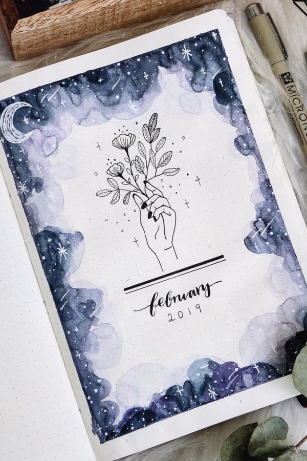
Photo credit: Lola CJ on Instagram
I can’t get enough of this watercolor cover page! The drawing of that hand with flowers really draws your eye in and sets the tone for the spread. Not to mention the amazing watercolor border of the night sky. If you’re going for a more moody theme in your bujo, then this one would be a great cover or an awesome border for your sleep tracker. Go to the moon and back with this awesome cover ?
Floral Cover Page
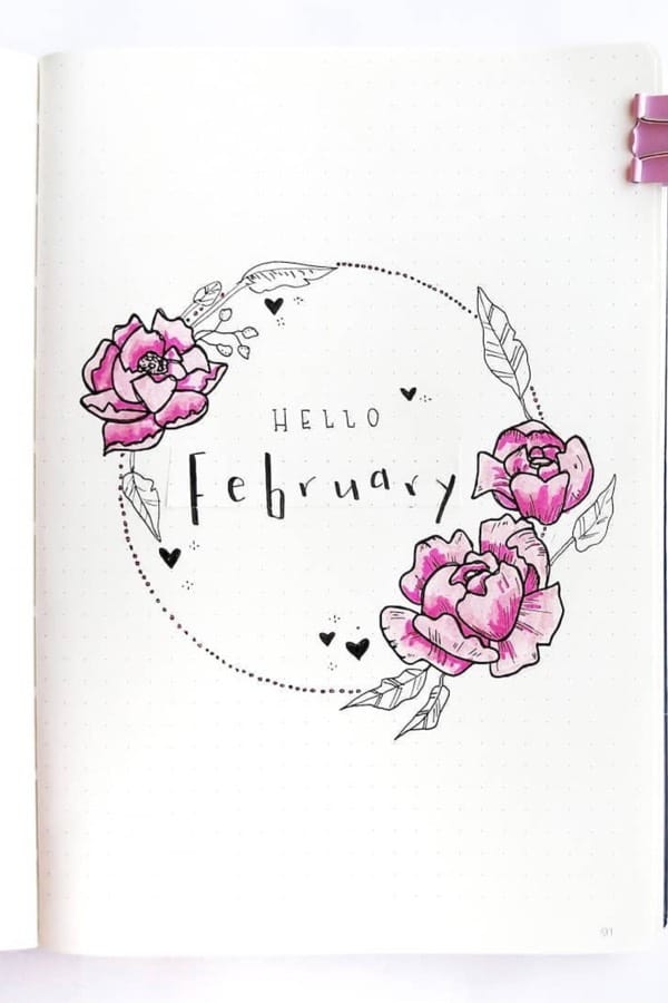
Photo credit: Bujo & Watercolour on Instagram
What’s a February monthly cover without some flowers?! (I have plenty more if these aren’t your style). I personally really like how she has the spread set up with the flowers creating a circle around that simple but cute font… Plus, those cute little hearts are definitely something I can take inspiration from since they’re so easy!
Related Bujo Post: 23 Must See June Monthly Cover Ideas
Shiba Inu Cover Page

Photo credit: Daisy Affairs on Instagram
This cover page is too cute! Since a lot of the cover pages are floral or Valentine’s theme, this is a great spread to switch things up with. I love how there’s plenty of blank space but the dog is perfectly placed in the bottom corner. Not to mention how good the actual drawing is! Switch up your monthly theme with this fun dog spread!
February Watercolor Cover
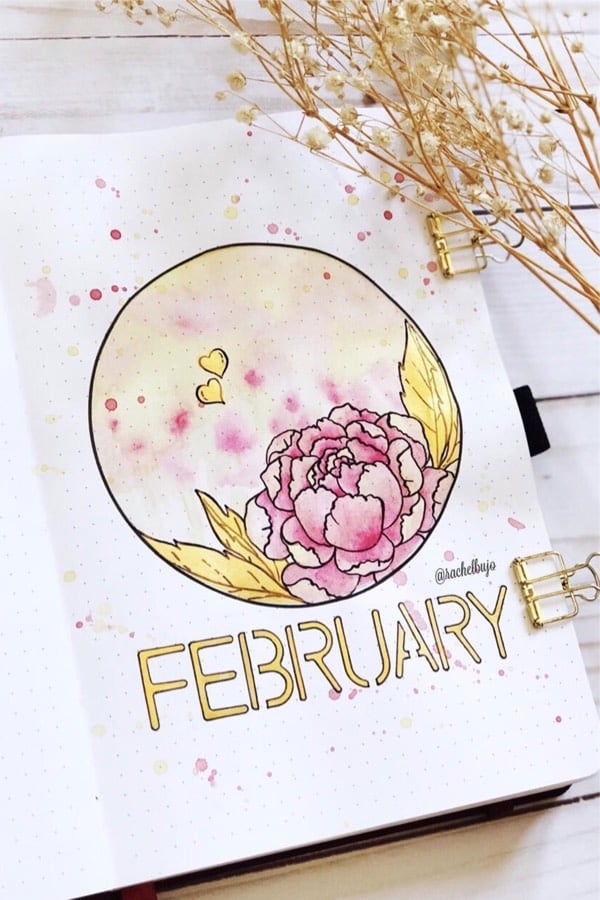
Photo credit: Rachel Doan on Instagram
Here’s another amazing watercolor spread! It’s almost like the first two examples were blended together to create the page. I love the super detailed flowers along with all the splatter from the watercolor. Even better, the February text was made with a stencil and that’s something I can totally do lol. Grab your pencil and a stencil to try this monthly cover ?
February Cover With Washi Tape
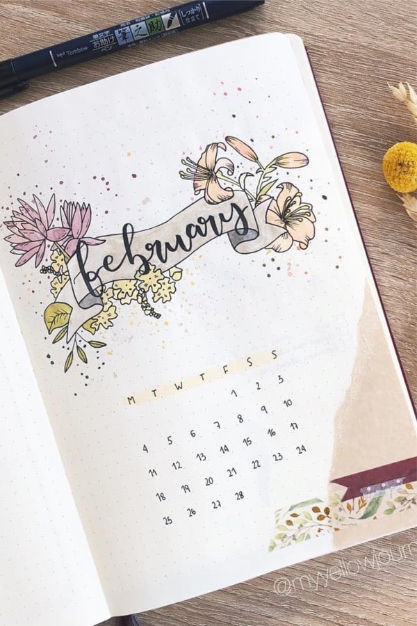
Photo credit: Sergio on Instagram
I know this is another floral cover page but I love the details on this one! The banner with the February text is definitely something I can pull inspiration from even if those flowers are a bit out of my artistic ability. The calendar is super simple and looks great in contrast to the intricate drawing above. Plus, the washi tape finishes off the entire layout! Go detailed or stay simple with this cute cover page!
Doodle Cover
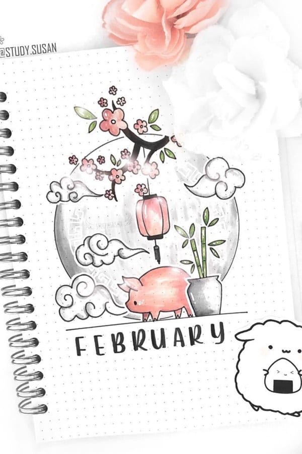
Photo credit: Susan on Instagram
How fun is this Chinese New Year theme? She mentions in her Instagram post that the pig represents luck, fortune, and prosperity… what’s better than that!? I also really like the bamboo doodle which adds some color contrast to the page. If you’re getting any inspiration from the Chinese zodiac calendar, then this one is for you! Wish me LUCK trying to draw this one ??
Paper Fan Cover
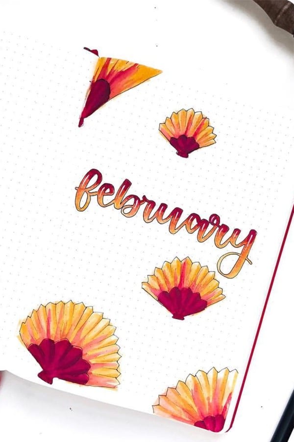
Photo credit: Claire on Instagram
The coloring on this monthly cover is amazing!! The gradient from red to orange in the text is awesome. That’s something I’m definitely going to try next time I break out my markers. Even if you aren’t a FAN of the fans… I think this cover would look great with just the February text. Maybe even add in some simple watercolor splatter in the background to spice things up?? I would make another fan pun here but I think one is enough ?
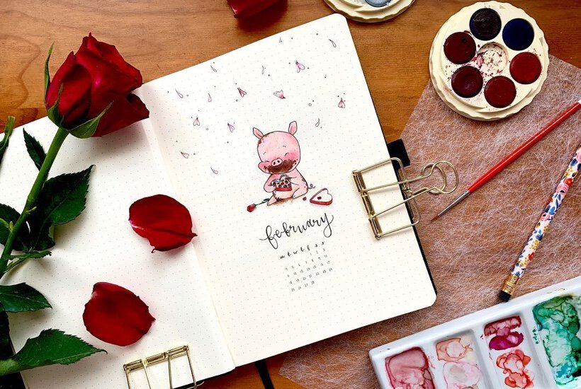
Valentines Cover Page
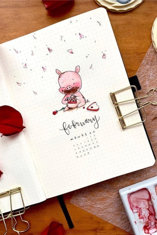
Photo credit: Cypriana on Instagram
Does anyone else look like this on Valentine’s day or is it just me?! I’ll definitely admit, this monthly cover is almost a portrait of myself after breaking open those chocolates… The falling hearts at the top are a cute little touch that I think could be applied to different spreads too. Plus, the handwriting for February fits the overall theme perfectly! Binge eat that Valentine’s chocolate and keep BUJOing
Symmetrical Monthly Cover
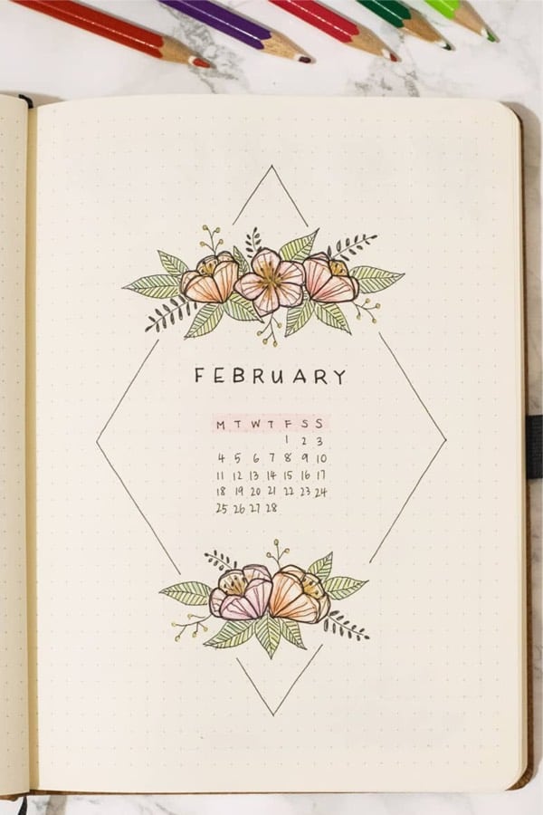
Photo credit: Paper Mango on Instagram
In my opinion, this monthly cover is the perfect blend of flowers while still being pretty minimal… Even if you aren’t going with a floral theme, I think this layout could be super cute! Maybe some heart doodles where the flowers are? Or even just the February text with the calendar for a super minimalist look would look great too. Stay balanced with this adorable spread!
Red February Monthly Cover
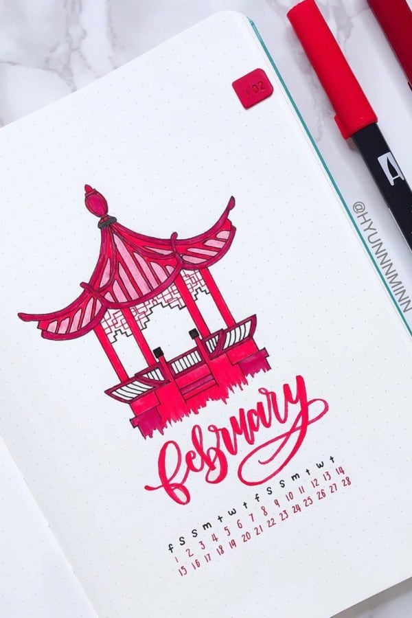
Photo credit: Hyunnnminn on Instagram
The way they use different shades of red on this cover page is amazing! Not to mention, the drawing of the Chinese pavilion is stunning as well. I really like how it still seems fitting for February with the colors and the Chinese New Year but… I had to include this one because of the calendar layout at the bottom. That’s something I haven’t really seen before. What do you think about it?!
Heart Cover Page

Photo credit: Kate on Instagram
No February monthly cover page list would be complete without a heart theme right?! I love the geometric edges with all the different shades of pink! It really makes the entire drawing pop. By now, I’m sure you know I’m a sucker for watercolor splatter and this one is no exception. Plus, that super simple border is something that could be added to any spread while still looking great. I HEART this monthly cover!
Hand Drawn Rose
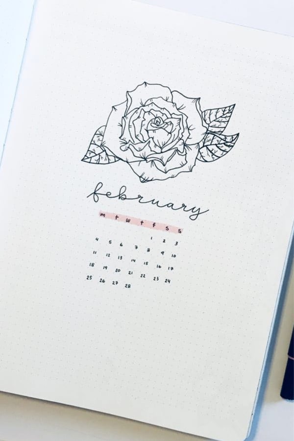
Photo credit: Trine Lise on Instagram
Gosh… this monthly cover almost looks like it could be a tattoo! (minus the February part lol). I love that it’s all black and white except for the simple highlight. Even if you don’t like the rose, I think the spread would look super cute with the calendar and the heart drawing from the previous example down in the bottom right-hand corner. Yes… no…? I like the idea. Will you accept this rose?!
Related Bujo Post: Best Bullet Journal Hacks
Water Color Flowers
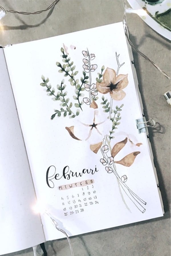
Photo credit: Ambers Notebooks on Instagram
I love this monthly cover since it’s not your typical February / Valentine’s theme. The very light colors give it a super cute vibe… paired with the string lights for the pic, love it! While this doesn’t have any splatters, I still really dig it lol. Start your month with a full bouquet!
Abstract February Cover
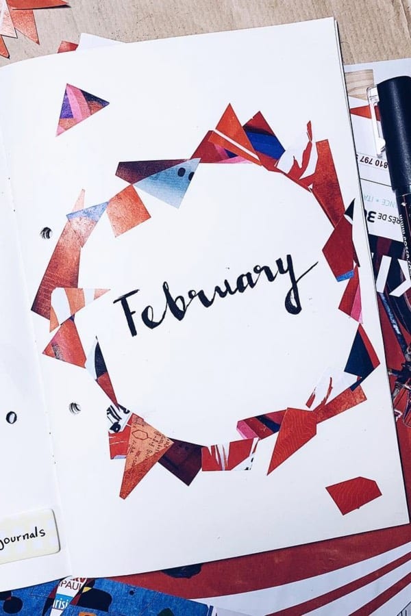
Photo credit: FZ Journals on Instagram
Thinking I was only going to include flowers and hearts?! I know there’s a lot of them but how about this awesome abstract monthly cover? The idea of using cut up color paper or old magazines is something I could totally do. No drawing required… sign me up! I think it would also look really good with the pieces of paper all in one corner!
Yellow Heart Cover
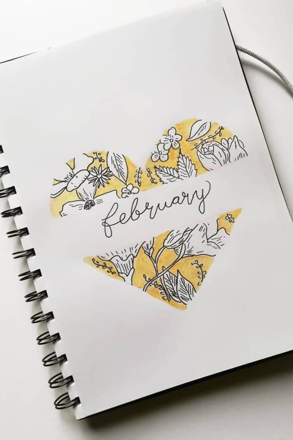
Photo credit: Leniis Blog on Instagram
Not red and pink but still a heart theme? Perfect! I love the layout of this cover page and how she has a blank space in the middle for the text. The way she set up the floral pattern inside the heart is something you could try on anything to fill it out. This monthly cover is super cute ?
Polaroid Theme
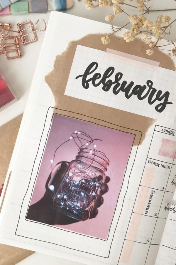
Photo credit: Minimal Studying on Instagram
I mean who doesn’t love string lights and bullet journals!? The way she set up the picture to make it look like a polaroid is too cute… Plus, the brown paper looks like it’s coming out of the jar which is super creative! This spread looks “pro” but even if you’re just starting off, this is something you could recreate pretty easily. Even if you don’t use this for February, it would be an awesome summertime cover too. Light up your month with this cute spread!
Hand Drawn Flowers
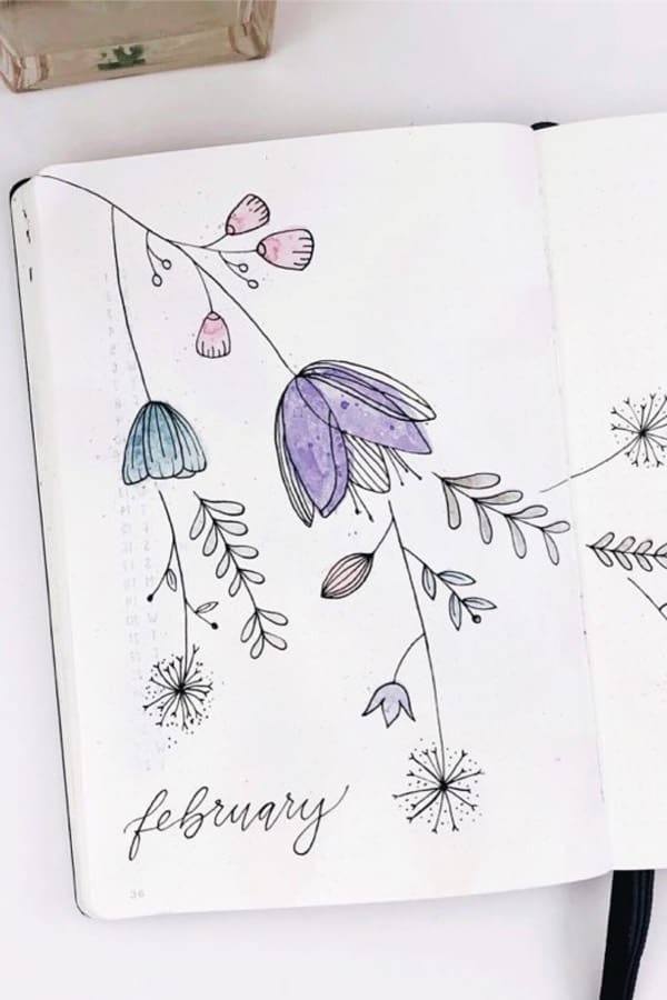
Photo credit: Cam on Instagram
This spread is perfect if you want to go with a floral theme but don’t want the typical roses… I love how they take up the entire page and are pretty simple in concept. She really makes them stand out with the colors she uses and I think she adds just enough without overdoing it. You could even change up the colors to match the current theme you have going in your bujo! Water those flowers and start your productive month with this cover
Magic Potion
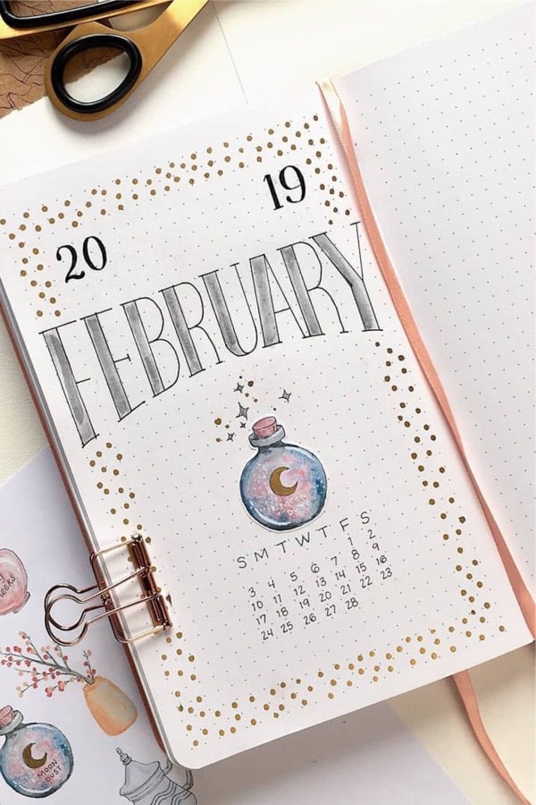
Photo credit: Mellow Days on Instagram
Want to go with a magically theme this February!? If so, then this spread will definitely spark your creative side. I love how the text is shaped… it reminds of those old school Microsoft fonts that you would use for a school project. Even better is that awesome sticker that pulls the whole cover together! This is something I could definitely do. Mix up that magic potion this February!
Rose Gold
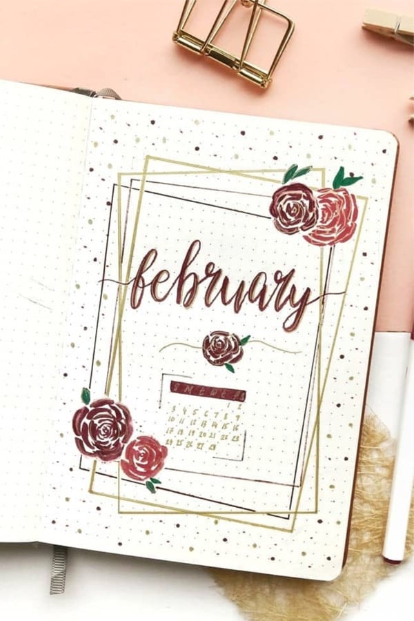
Photo credit: Nabaa on Instagram
While this isn’t the first rose theme on the list, I just had to include this one! The gold color throughout the spread really pops against the dark red colors… Plus, just like the one above, the black and gold border would look good in anyone’s bullet journal. What’s better than gold and roses?!
Related Bujo Post: 17 Amazing Step By Step Flower Doodles For Bujo Addicts
Black & White
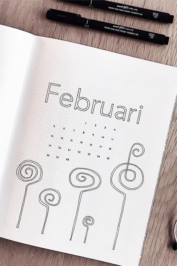
Photo credit: Stina Skagert on Instagram
Looking for something super simple!? If so, then this monthly cover should give you some ideas… Even if you don’t like the doodles at the bottom, I still think it would look amazing without them. The simplicity of the calendar and the text makes it a great spread if you’re going with a minimal theme. Maybe add some watercolor splatter? No, okay… I think we’ve had enough of that?
Related Posts:
- August Monthly Cover Ideas For Summer
- July Monthly Spread Examples For Inspo
- Bullet Journal Monthly Covers With Doodles
Pin To Save For Later!
- Save this PIN HERE to your Pinterest board!



Leave a Reply