Featured Image Credit: Bujo With Tea
Another month and another week to start in your bullet journal… I know I find myself scouring Instagram for new ideas whenever I’m feeling stuck. So if you’re anything like me, these May weekly spread examples are going to help cut down on the endless scrolling! I tried to include a nice variety but I’ve definitely leaned towards the more basic spectrum here. Don’t worry though, there are still some very detailed and intricate spreads here too!
Here are the ones I picked:
Multi-Purpose Weekly Spread
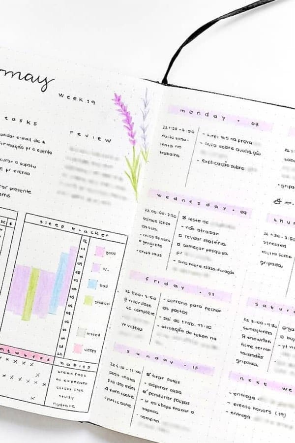
Photo credit: Rosana on Instagram
I know this spread looks pretty complex but at the core, it’s actually pretty simple! This would be a great layout if you’re just starting your bujo journey (or really even if you’ve been journaling for years). The way she has the expense and sleep trackers on the opening page is such a great idea! I know for me, it would save a bunch of time and it would be easier to update throughout the week since everything is on one page. Knock out multiple pages with this awesome spread!
Zodiac Sign Spread
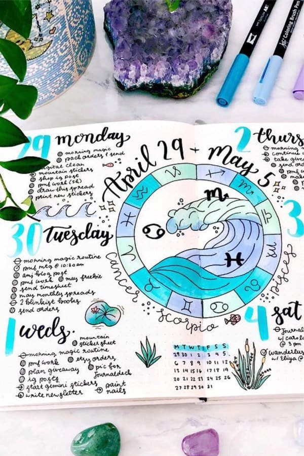
Photo credit: Sarah on Instagram
Any horoscope lovers out there!? If so, then this circular weekly spread will definitely give you some ideas for your own bullet journal… I love all the different shades of blue she used throughout both pages, not to mention the cute wave and plant doodles! You could also adapt the concept of this layout and apply your current theme to something similar. Keep up to date with your daily horoscope with this weekly log!
Related Bujo Post: Best Bullet Journal Hacks
Week 19
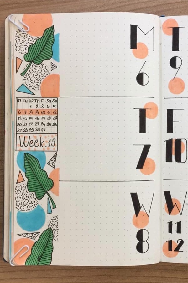
Photo credit: Istanbullet on Instagram
This spread is soooo cute! The way the doodles are set up in the left sidebar gives the theme a playful vibe but still looks clean since it’s contained. To me, it almost has a 90’s feel to it with the shapes and squiggles. Moving over to the daily section, I really like how they’re labeled with one bold letter and the number of the day. If you’re going for a minimalist look, you could leave out everything except for that and I think it would look perfect! Go for a bold 90’s floral theme!
Cute & Simple
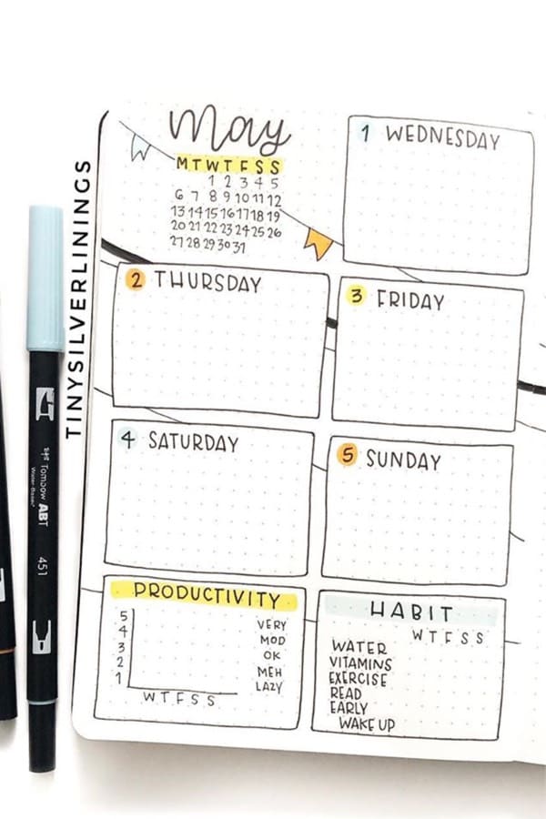
Photo credit: Viv on Instagram
Like I mentioned in the first example, I absolutely love the idea of a simple productivity and habit tracker at the bottom of any weekly spread… This one is no exception! It’s super simple but even more, effective and a bujo beginner could set this spread up in no time. If you want to save time by setting up multiple trackers on your weekly spread, then this one is for you!
Drop Down Spread
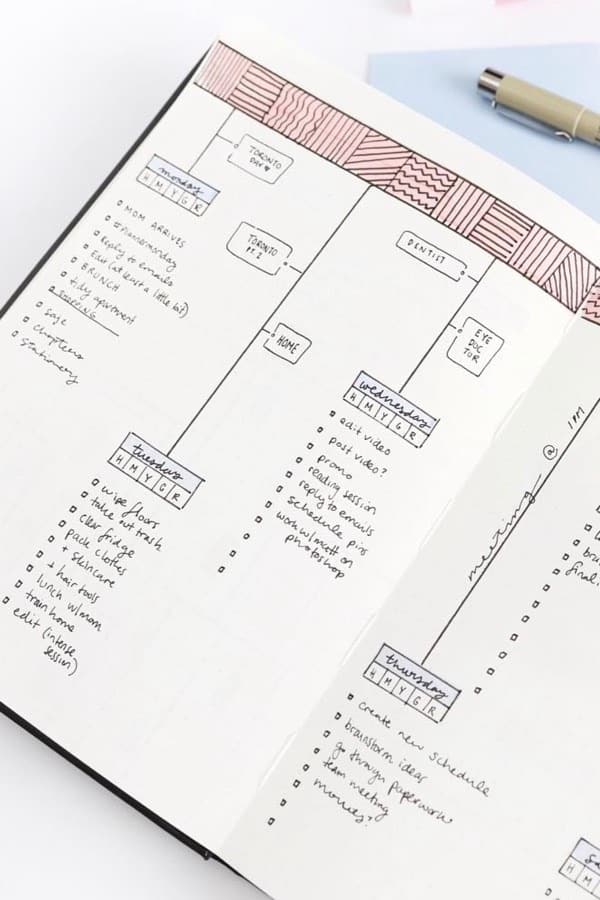
Photo credit: Caitlin’s Corner on Instagram
This layout is super creative! I don’t know about you, but I hadn’t seen anything like it until I came across this spread. The way she has the places she needs to go on the drop down line to the daily tasks is so cool… This is another spread that would be perfect if you’re just starting out! It’s pretty simple but in my opinion, looks amazing. Pop, lock, and drop into a new week!
Minimalist Moon Spread
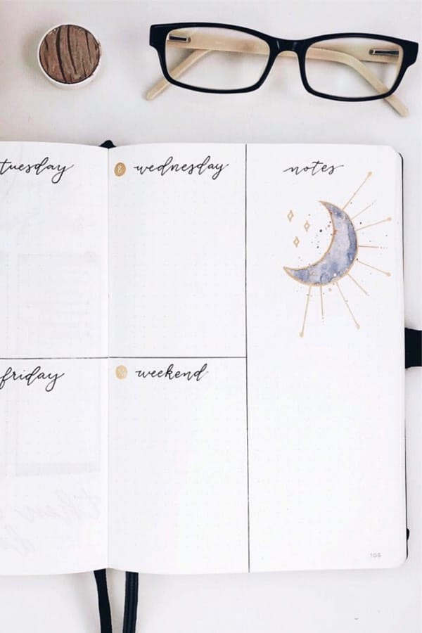
Photo credit: Cam on Instagram
Here’s another super cute and minimal weekly spread for the space lovers out there… The space theme isn’t super typical with a ton of stars and planets, which is why I love this one so much. She kept it very simple but I think that’s what makes it so good! Not to mention the actual layout of the spread… I don’t think it gets any easier than that but the handwritten headers are perfect. Keep it simple and shoot for the stars!
Related Bujo Post: Best Harry Potter Bullet Journal Spread Ideas
Artsy Floral Theme
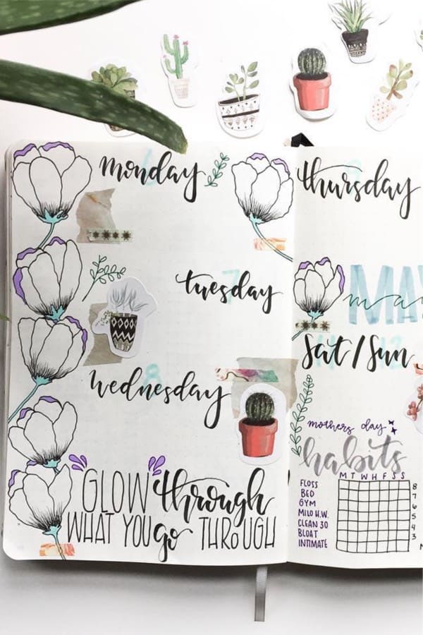
Photo credit: Kels on Instagram
This layout is the perfect contrast to the example above… Even though it looks like there’s A LOT going on, once you take away all the doodles, it’s pretty easy! If you’re going with a spread like this, I would suggest setting it up by laying out the days first, then filling it out… Just like she did, you could then add the doodles, habit tracker and even a quote to really complete the theme. Keep calm and plan out your week!
May Space Weekly Log
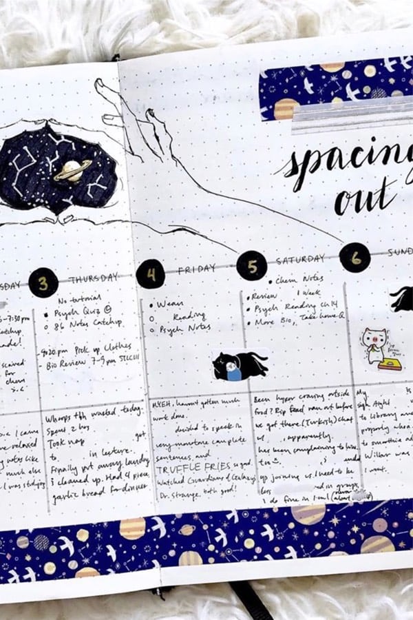
Photo credit: Bujo With Tea on Instagram
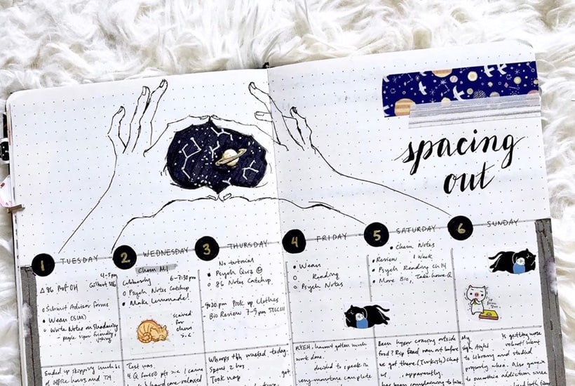
This is another space themed weekly spread that I just had to include since it’s so creative! The way she has the galaxy drawing inside the opening of the hands is awesome… Not to mention the star and planet themed washi tape at the bottom. I even think it would good without all of that though lol. The actual layout for the daily tasks is something that I could set up with my very basic artistic ability. Once you have you’re week planned out, it’s time to space out!
Sushi May Theme
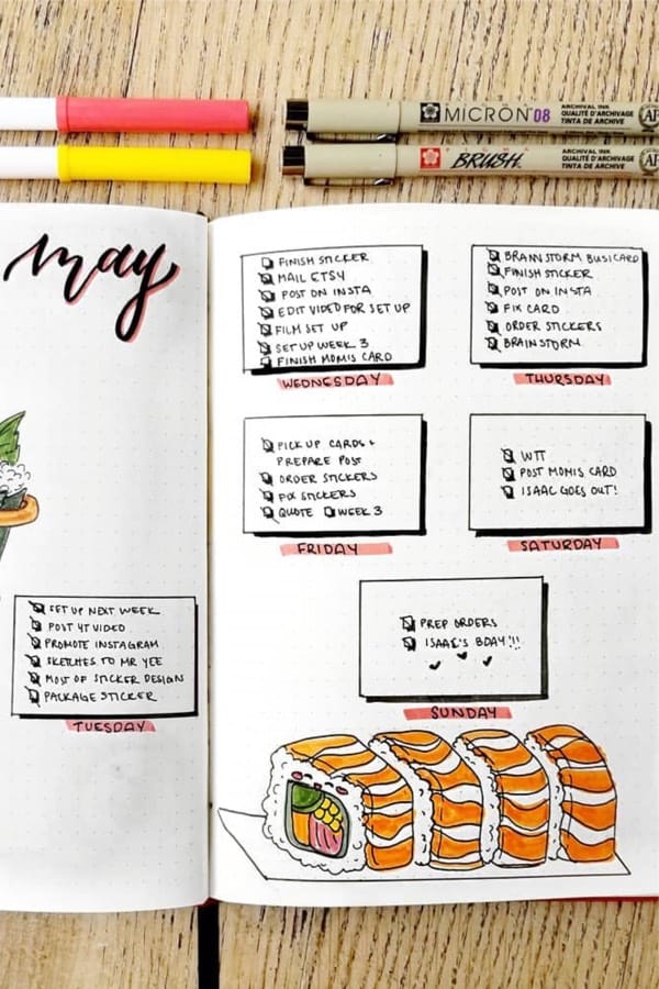
Photo credit: Julianne on Instagram
Have you tried a tempura Philadelphia roll?? If you haven’t already, I highly suggest! It’s not normally on the menu but if you ask for the Philly roll to be tempura’d, they will usually do it for you. It’s to die for. Sorry, I’m a little hungry, back to the spread! I’m a sucker for a simple layout and I love the fact that she has a drop shadow on the boxes. With a very simple spread, it lends it’s self to keeping it basic and only tracking the essentials. I know, I find myself something adding more stuff to my bujo sometimes and it just stresses me out. Go back to the basics and keep (sushi) rolling!
Easy May Weekly
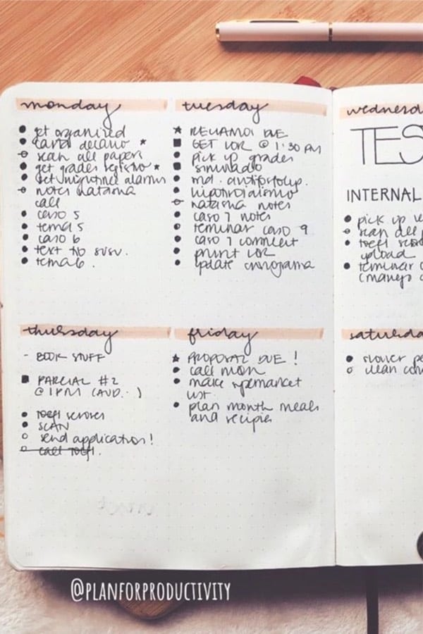
Photo credit: Plan For Productivity on Instagram
Speaking of keeping it basic… This weekly spread is the perfect example! Now, even though I saw basic, that’s not a bad thing in my mind. She keeps the layout very easy to set up and simply highlighting the daily headers is the perfect way to break things up! Whether you’re on your third or fourth bullet journal or just setting up your first, this is a spread that could be utilized for any week of the month Don’t get too fancy, stay productive!
Black & White Spread
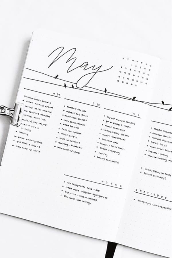
Photo credit: Aarti on Instagram
Gosh, this spread is soooo satisfying. Her handwriting and lettering is amazing! I’ve been featuring a good amount of simple layouts but you just can’t beat the simplicity. Even the birds on the power lines at the top is such a cute addition. Still sticking with the black and white theme but adding a little something to break up the layout… love it! Plus, the gratitude log at the bottom is another great idea that really completes the theme. I’m grateful for this awesome spread!
Half Page Days
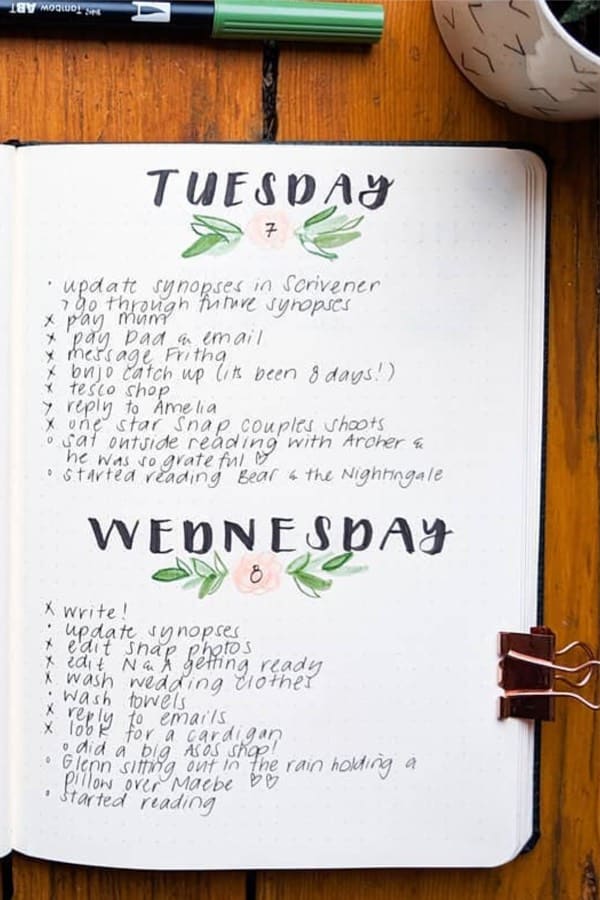
Photo credit: Lauren on Instagram
Need a lot of room for all your daily tasks!? If so, then this spread with half page daily task sections will surely give you some ideas! I love the cute headers with those simple little flower doodles for the numbers. This type of spread really lends it’s self to staying focused and not getting overwhelmed with all the bullet journal “extras”. As you’ve probably noticed, I can always appreciate a basic weekly spread!
Vertical Weekly Spread
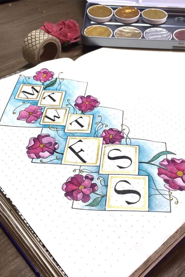
Photo credit: Hannah’s Bullet Journal on Instagram
Looking for more a creative floral spread to change things up with?! If so, then this one will definitely give you some inspiration… I love the shading of the blue background and the flower doodles are next level! Now is this the most practical weekly spread?… probably not, but that’s not the point! I had to include this one since it’s super creative and I haven’t seen too many vertical layout’s like it. Don’t be afraid of change!
Weekly Focus Spread
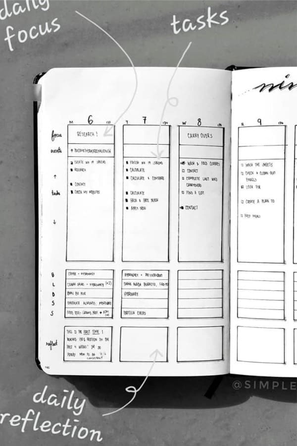
Photo credit: Sue on Instagram
On the other hand, this spread is SUPER practical… She has a daily focus section followed by another section for any events. Below that is her daily tasks with plenty of room to keep track of everything! Continuing on beyond the daily tasks is her meal section. I personally don’t track my meals on a daily basis but it’s definitely something I might add when I start prepping my meals for the day. And last but not least is here daily reflection area to take notes and record anything that she might want to remind for the day. Overall, I really like the layout and the features she’s added to the spread!
Planet Weekly Spread
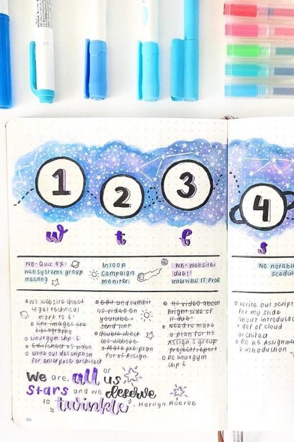
Photo credit: Study Aesthetics on Instagram
I couldn’t leave out yet another space theme… The way she has the galaxy pattern behind the daily numbers is something I think could be applied to many different spreads. Maybe the top corner or background of your monthly cover?! Plus, I always love a good quote! Especially with the gradient coloring like this one has. “We are all of us stars, and we deserve to twinkle” – Marilyn Monroe
Mandala Weekly Spread
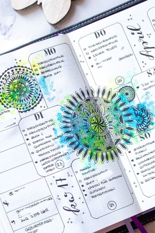
Photo credit: Simone on Instagram
This spread has a great balance between the artsy aspects and the daily task layout! Not to mention, the blue and green watercolor splatters over the mandala shapes are so cool… I don’t think I’ll be drawing something like that anytime soon, but I can definitely take inspiration from the watercolors! Maybe adding something like that over so simple black and white doodles at the bottom of a spread?! Just throwing it out there lol… Spark your creative side with this fun spread!
Simple May Weekly Layout
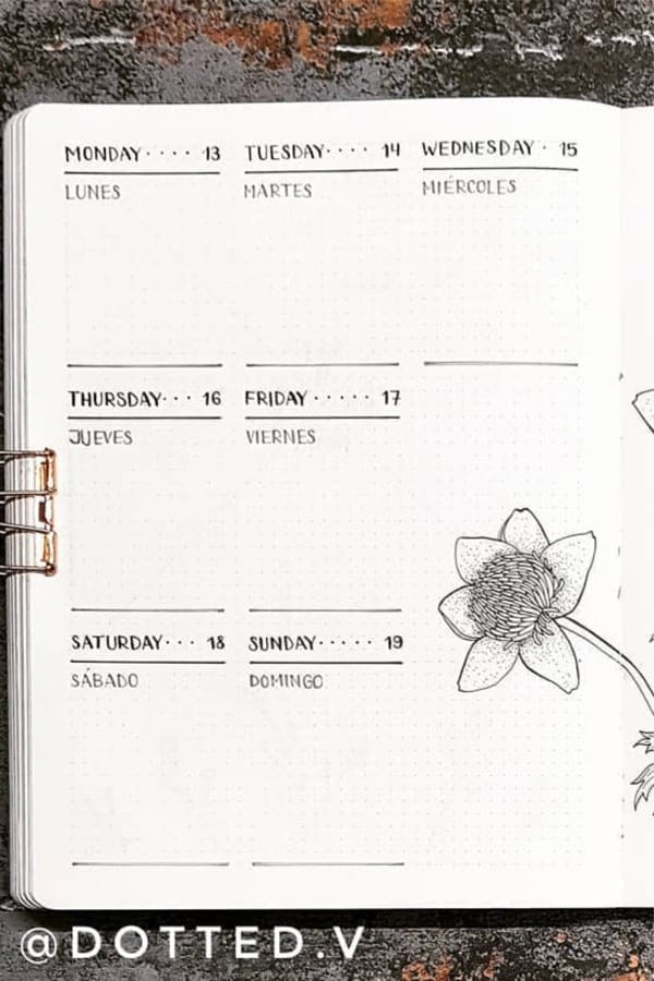
Photo credit: Dotted V on Instagram
Coming back to a more minimalist weekly spread is this pretty easy layout… They do include a very detailed drawing of flowers in the middle but if you left that out you could have yourself a very great spread set up in no time. If you want an easy spread but don’t want something super boxy, this one is for you! Plan out your week and get to work!
May Weekly Log
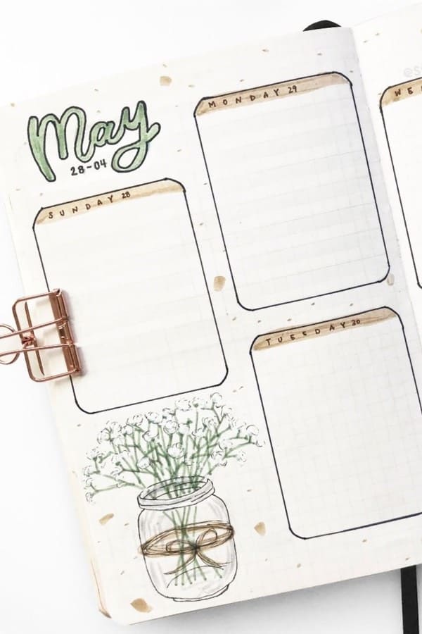
Photo credit: Susan on Instagram
If you are looking for more of a boxy theme, then you’ll like this one! I think it has a great blend of the boxy feel but the rounded corners make it a lot less harsh… the addition of the mason jar and flower doodle at the bottom continues to add to the less harsh vibe. Plus, the simple color combo looks great with the overall theme. Keep it cute and simple this week!
Related Bujo Post: Best Cactus Doodle Ideas
Butterfly Weekly Spread
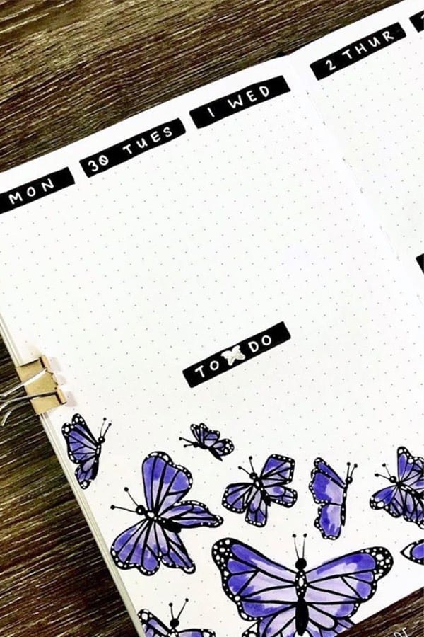
Photo credit: Kristie on Instagram
I love the layout of this spread! The daily headers with the white text is super simple but always looks great… Plus, the butterfly doodles at the bottom are ridiculously good! Even if you aren’t as artistically gifted as Kristie, the basic layout of the bold headers is definitely a great idea to try when you’re in a pinch for time. Spread your wings and Spring into Summer
Purple Pastel Spread
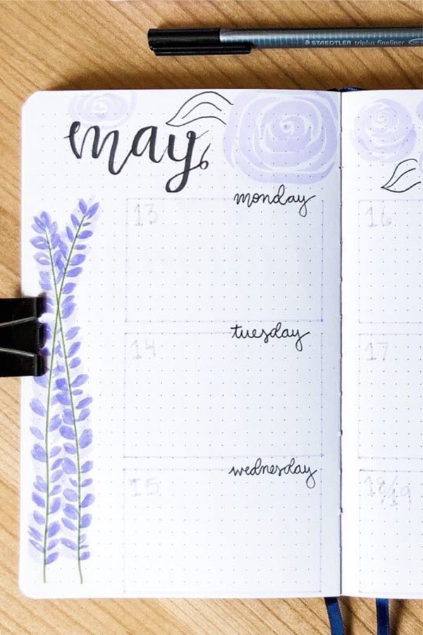
Photo credit: Kylie on Instagram
Last but definitely not least is this amazing purple spread… I’m in love with the super faint outline for the daily task section! It’s easy to set up and the lavender / rose doodles really bring together the entire page. If your theme doesn’t work with purple, the basic layout in a different color with theme correct doodles would look really good! What kind of theme are you going with… bold or faint!?
Related Posts:
Follow Me On Pinterest!
Pin To Save For Later!
- Save this PIN HERE to your Pinterest board!
Leave a Reply